
Challenge
The challenge is inspired by a friend’s experience and my observation. In Taiwan, the free legal service is principally affiliated with the local government to assist low-income individuals with legal aid. As one of the government services, it is hidden in the menu and not easy to navigate. As a result, users often get confused and struggle to take advantage of the service.

My Role
This project was done individually. I planned and directed the whole thing, including UX research and UI design.
The Goal
The goal is to create a dedicated and responsive platform that focuses on the most valuable features, integrates and streamlines the existing user flow, and tailors it to all users.
To empathize the user
User Research
I conducted interviews with current visitors and surveyed the statistical data. The legal organization report showed that nearly 40% of applicants are from marginalized groups, such as impaired persons, new immigrants, and Aborigines. Considering the trend towards a "super-aged society" with over 20% of the population being elderly, this demographic also needs to be taken into account.
Two types of users were identified :
- Immigrants who are not familiar with public resources
- Elderly persons with basic technology literacy and visual impairment
The frequent tasks should be considered in the web app :
- Consulting a lawyer about legal problems
- Obtaining resources to solve legal issues in a cost-effective manner
- Looking up reliable information about legal issues they are facing.
Paint Points
-
Usability
The screen is cluttered with irrelevant content and key functions are hidden in a long list menu.
-
Guidance
Lack of clear instructions on what services are provided and how to get started and follow through.
-
Terminology
Complex jargon is used instead of plain language, which makes the content seem unapproachable and difficult to understand.
-
Scheduling
Some topics can only be discussed on specific weekdays and at certain offices, making it difficult to arrange appointments.
Persona

"I'm new as a business owner, and the legal issues often completely baffle me."
— Gerald, a 26-year-old second-generation immigrant and shop owner who barely accesses public services.

Goals
- Attend a consultation meeting in a way that fits his
schedule and needs
- Find an affordable lawyer who specializes in his issue
- Obtain reliable information to manage legal issues
Frustrations
“The website is just packed with official reports and stuff, and it's a real pain trying to go through all of it.”
"There seems to be a lot of red tape to go through, and it's putting me off."
"I don’t know how to organize my information and am not sure if my document is well-prepared for consultation."
Bio
Gerald has a Vietnamese and Taiwanese background. He started his business as a franchisee with a loan. He works an average of 12 hours a day, focusing on providing excellent service, which has earned him positive Google reviews.
However, he is often unhappy with the agreement, especially the high cost of materials from the franchiser, which leaves him with little profit. He is looking for legal help to understand how to protect his rights.

"Being a life-long learner makes me feel active. I'm confident that I can handle my daily activities well."
— Martin, a 74-year-old elderly individual with limited digital literacy and visual impairment.

Goals
- Address legal problems on his own without bothering
outsiders
- Accomplish tasks by following simple and clear steps
- Understand how to utilize technology in managing legal
problems.
Frustrations
"I love using smartphones, but if they seem too complicated, I get worried about pressing the wrong button."
"The text is so small, and there's too much stuff that just confuses me all the time."
"I don't understand some of the terms on the page, and I don't even know where to start."
Bio
Martin has been retired for 15 years and lives in a rural area. He is farsighted and needs to wear glasses to read. He has been keeping a dog for 8 years and walks the dog every day. Unfortunately, his dog has been hit by a scooter several times and got hurt.
Martin would appreciate a legal service that can help him settle the dispute or take legal action without involving outsiders.

User Journey Map
-

Browse the website
- Anxious to quickly find relevant information
- Uncertain about where to begin exploring -

Fill out the form
- Unsure how to effectively summarize the issue
- Feel hesitant about seeking assistance -
Schedule a meeting
- Unsure if the appointment has been confirmed
- Confused about whether certain type of issue can be scheduled on available time. -

Prepare documents
- Unsure what kind of document should be prepared
-

Attend the meeting
- Anxious about forgetting the scheduled meeting time
Low Effort
Feature prioritization
Make an appointment
Referrals to legal organizations
Appointment inquiry
Step-by-step guidance
Accessibility features
General legal knowledge
Introduction of the website
Must Have
Quick action button for phone calls
Share via SMS
Share via email
Print out information
Contact us
Search for topics
2-Step Verification
Good to Have
Specific issue appointment
Categorized meeting type
Edit appointment
Online Donation
Volunteer recruitment
Educational events
Chat feature
Down legal documents
5-star rating surveys
High Effort

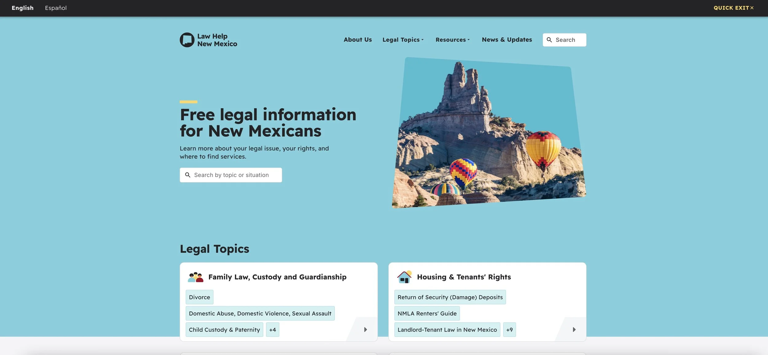
Competitive Analysis
Legal Service
Commission South Australia
Legal Help
New York
Law Help
Oregon
Features

Readable content
Cross-platform consistency
Step-by-step guidance
Accessibility
Well rounded accessibility features
-Large clickable buttons
-High color contrast
-Clear content hierarchy
When comparing self-help legal resources in the USA and Australia, both countries have tailored websites to serve diverse demographics. These websites primarily offer legal information and guide individuals to local pro bono clinics.
In contrast, the websites in Taiwan mainly focus on appointment scheduling and lack useful resources. Through Analyzing the functionality and user flow of these websites, I gained valuable findings for the product.
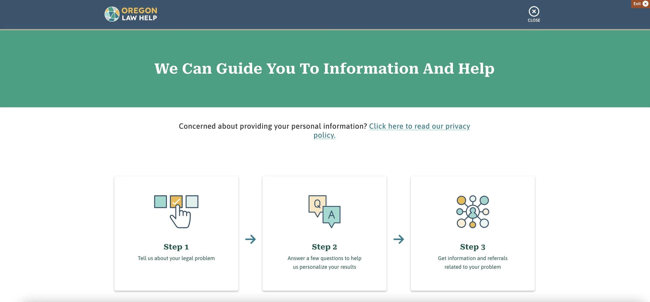
User Flow
Normal
Shallow menu level
Descriptive and friendly guidance
Show related content in the sidebar

2 language modes
Easy to complete tasks
Shallow menu level
Navigation
Normal
Clear menu breakdown
Law Help
Mexico
Focus on key features
2 language modes

User Flow
Make an appointment / Search legal topics & resources / Inquire appointment
I carefully outlined the user's typical path in four main tasks, taking into account feature prioritization and competitive analysis to ensure that the tasks are straightforward and easy to complete.

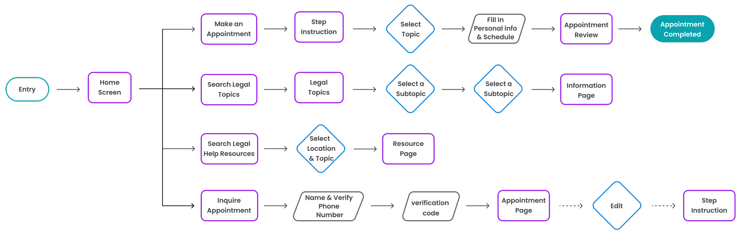
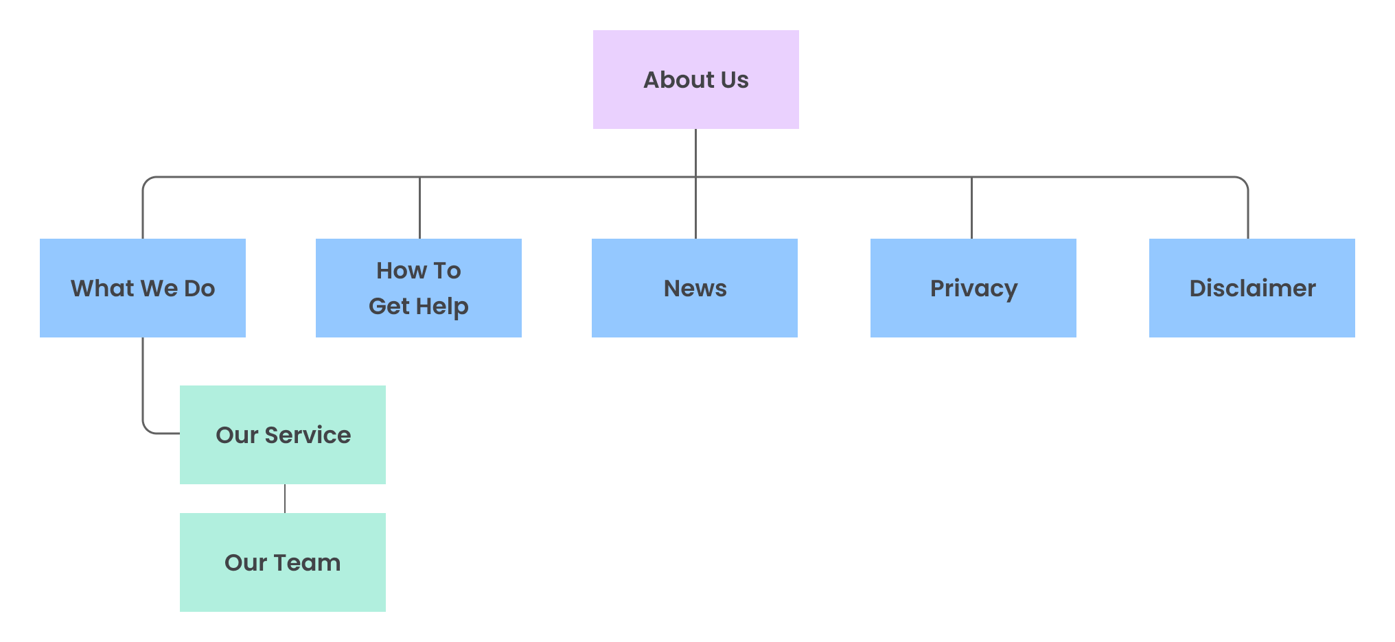
Sitemap
I constructed a framework that guarantees users can accomplish their major tasks. I implemented a hierarchical structure overall. The sequential arrangement of the scheduling process is designed to direct users to concentrate on one task at a time. This will address pain points and offer them effortless navigational experiences.

Header
I made sure to display the accessibility features and search bar prominently in the header, so that users can easily access them when needed.

Footer
The minor tasks have been strategically placed in the footer to reduce distractions for the user and minimize the overall interaction cost.

By integrating insights from user research, I prioritized three key features for the mobile version. Placing these features at the top ensures that users are directed to take their desired action first, with limited sub-categories below for effortless navigation.
Additionally, I strategically placed assistive devices below the header and included a phone call button for immediate assistance.
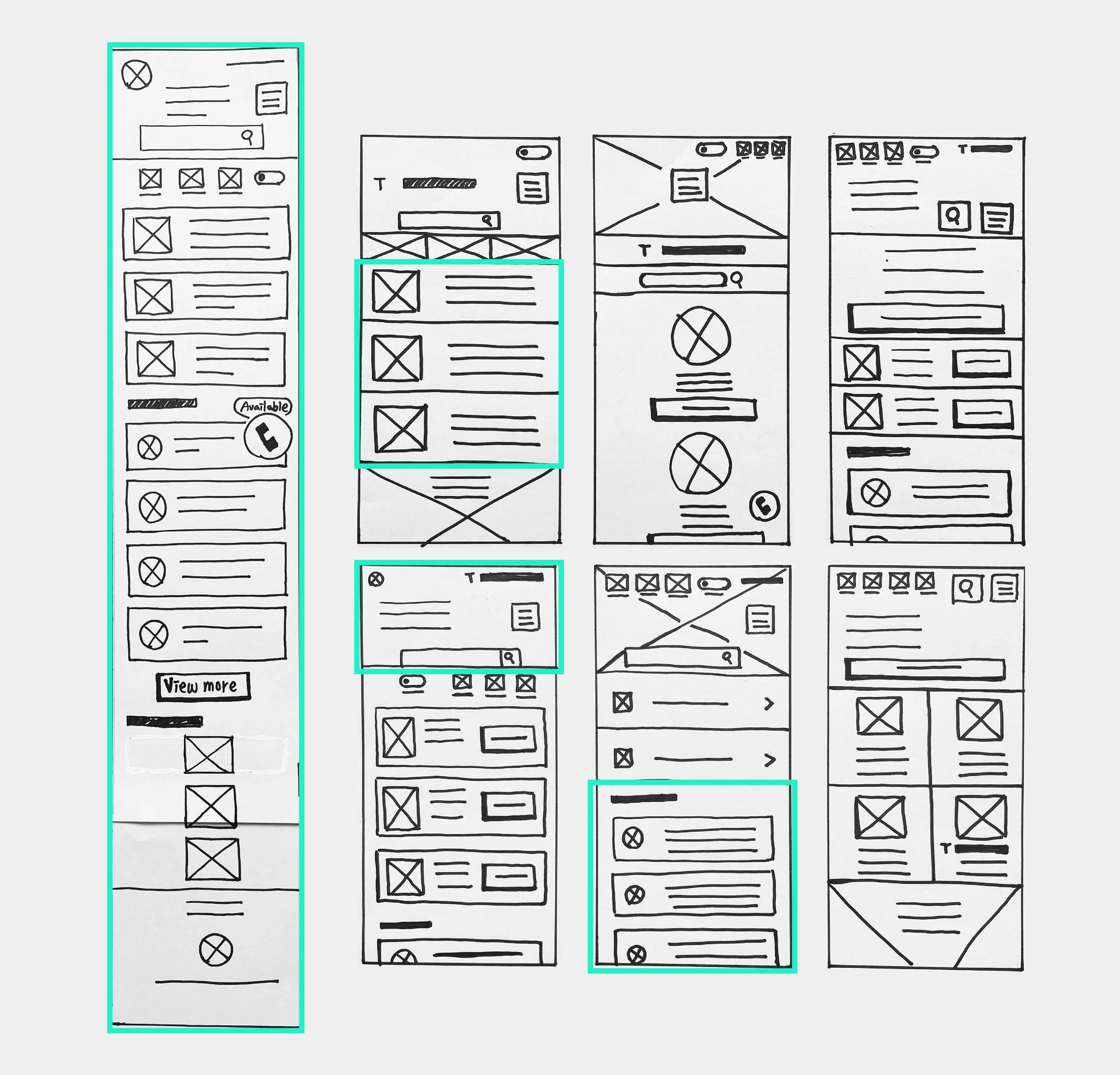
Paper Wireframe

Initial UI design and Wireframe
There are three primary tasks, making an appointment, finding legal information, and seeking resources. The features and sub-categories are represented with brief labels, appropriate sizes, and buttons.
Home Screen

Lo Fidelity Prototype
I created step-by-step instructions to help users easily schedule appointments. They can choose from the menu for a second confirmation.
To Understand the user
Usibility Study
Parameters
Study Type
Unmoderated usability study
Participants
Number : 5
Age : 21-75 years old
Location: Taipei
Length
15-20 minutes/Per
This study aims to uncover the specific challenges users encounter when completing core tasks on different devices. By tracking time spent, conversion rates, and identifying areas of difficulty, I can make informed design improvements.
Participants were asked to complete two tasks :
- Making an appointment
- inquiring about the appointment
The findings from this study will be crucial in enhancing the final design.
Findings
-
Label Naming
Users found the wording "schedule" on the schedule page confusing and were unsure if it was clickable.
-
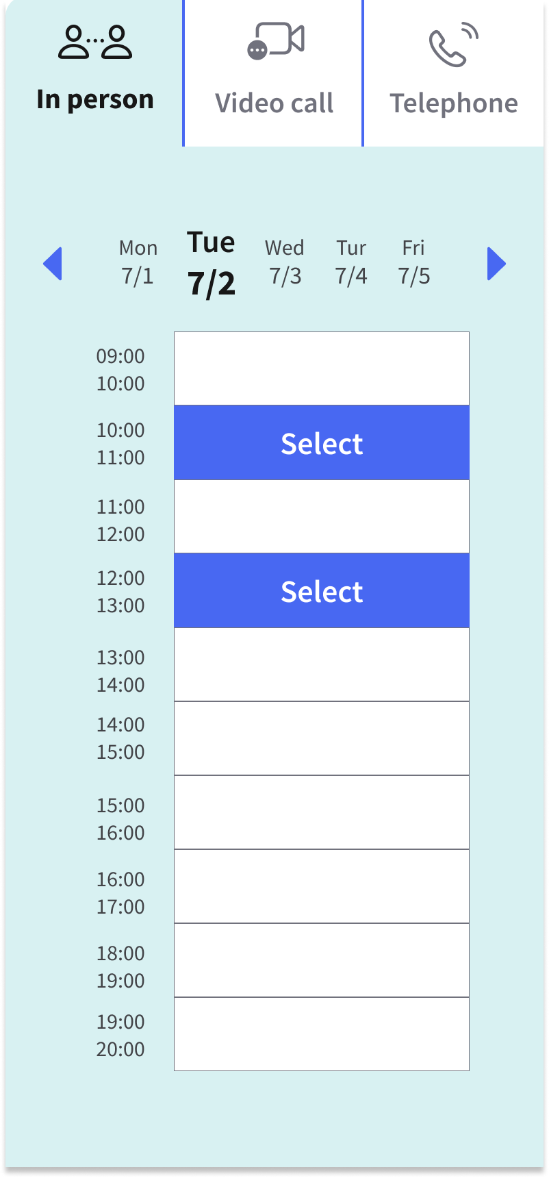
Calendar Layout
In the mobile version, the schedule table only showed one date, making it difficult for users to choose from other days.
-
Inquiry Results
Users also wanted a clearer confirmation that their appointment was successfully scheduled on the inquiry page.

Design Iteration
Replaced the word "schedule" with "select".
Provided a list of all dates within the specified date range, and highlighted the chosen date.
Removed the term "fully booked" for unavailable dates.
Informed the user that the appointment has been completed by using descriptive phrases on the inquiry screen.


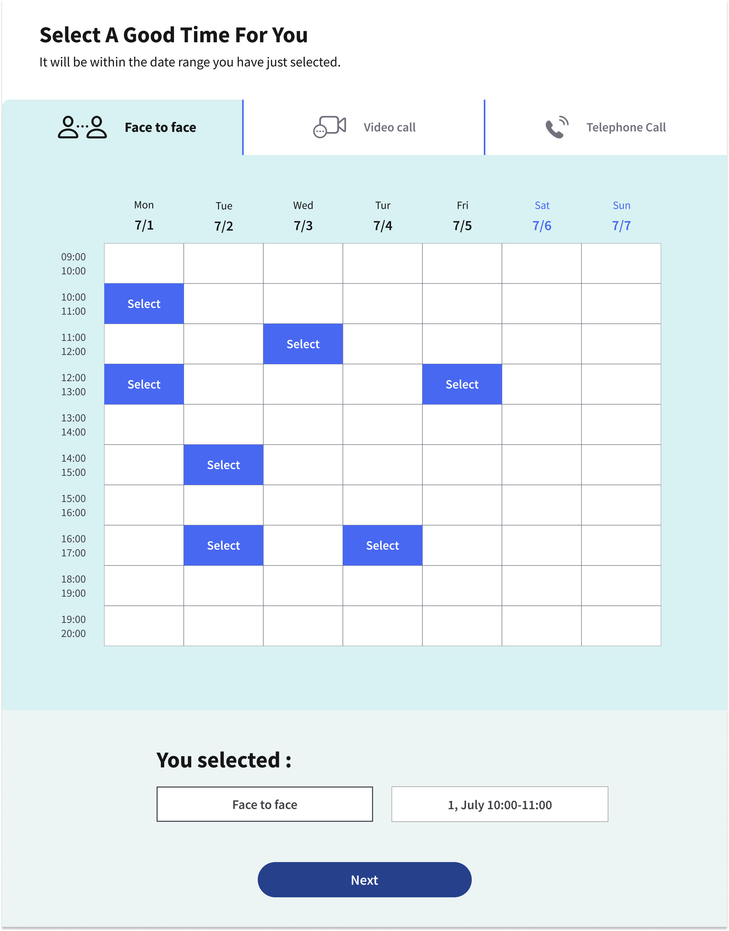


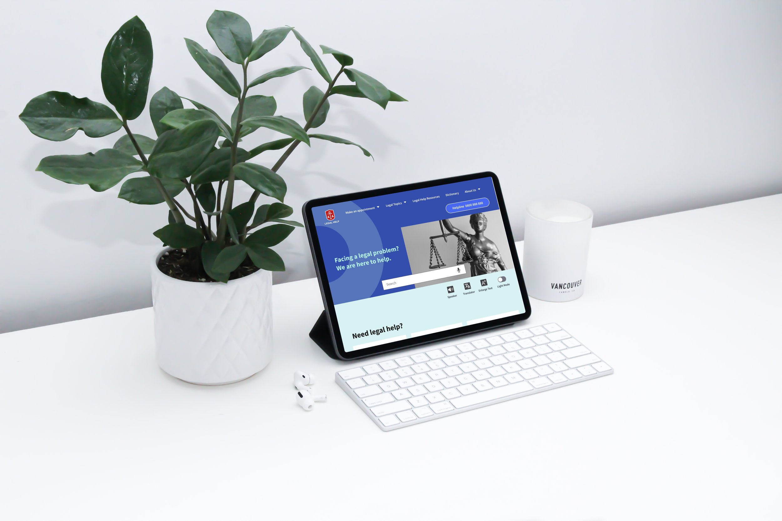
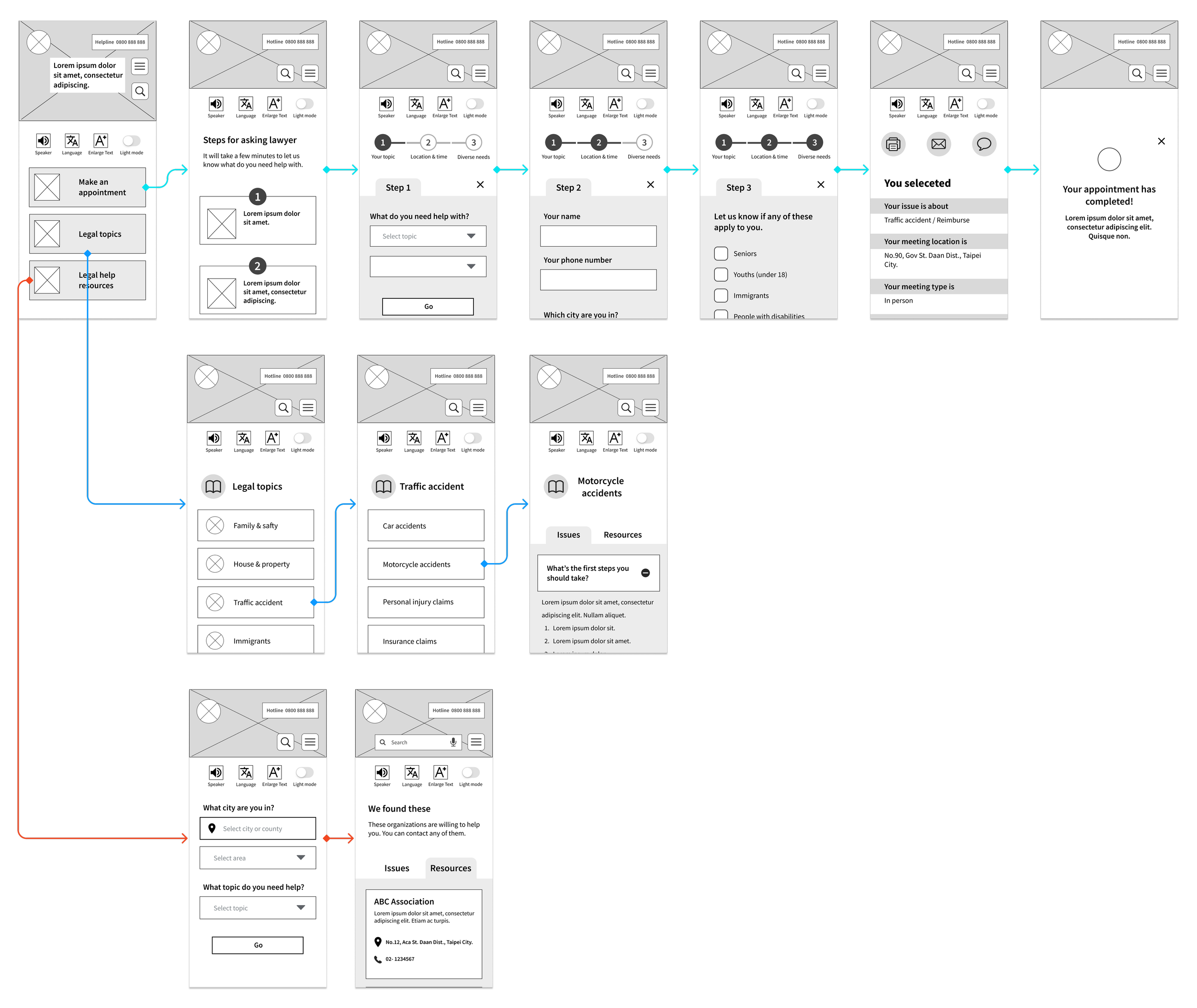
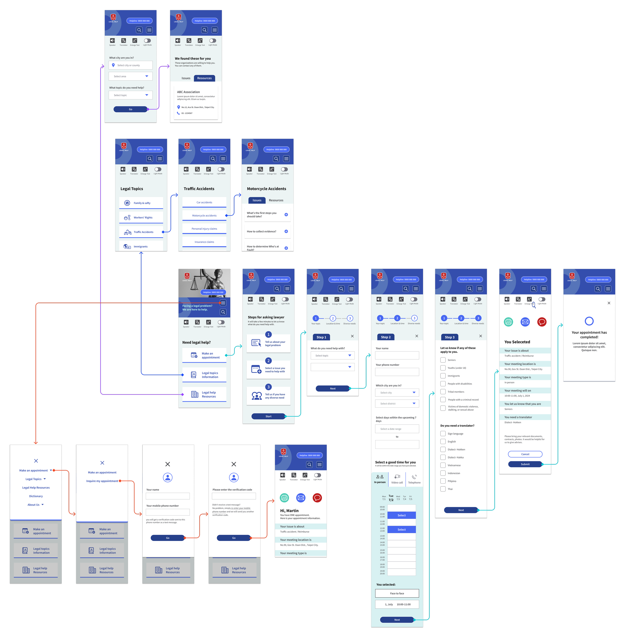
Hi Fedility Screen Flow
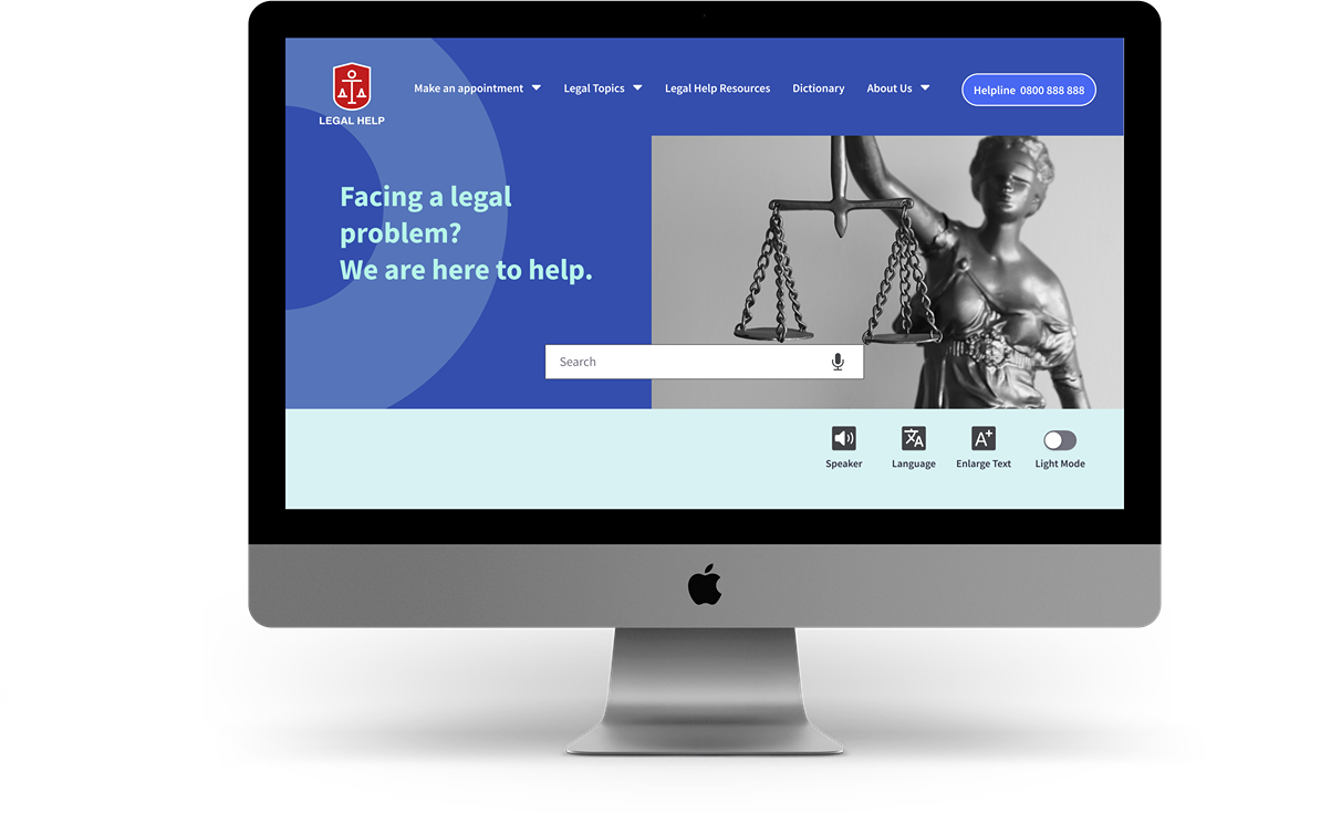
Check out the latest design! It displayed the key user journeys and thoughtfully included appointment details, accessible only to logged-in users. I chose a blue color scheme to convey professionalism and trustworthiness, while the vibrant red logo symbolizes positivity.
Home Screen


Hi Fidelity Prototype
Make an Appointment
Provided user-friendly step-by-step guidance and large, tappable buttons make it a breeze to complete the process, especially on mobile.
Search for Legal Information
Organized legal information by topic categories and presented it in a friendly Q&A format using plain language to make it more approachable for all users.
Search for Legal
Resources
Made it easy for all users to search for legal help organizations by issue type and location, and easily reach out to them at the information.
Inquire About an Appointment
Secured users' appointments by signing in with 2-step verification, and conveniently edited or sended details via email or SMS.
Assistive Devices
Made accessibility features easily accessible in the header, so users can apply them whenever they need.

Closing Thoughts
Takeaways
This project began as a requirement for my course - to create a social design. My focus was on addressing the specific needs of overlooked individuals and tackling the challenges they faced. Legal matters can be complex and stressful for many people. After surveying existing websites, I was inspired to design a unique website that caters to users' legal needs.
To ensure an optimal user experience, it's crucial to understand what prevented users from using the current website and their real-life needs. By aiming to facilitate equitable access to justice and making the product inclusive for marginalized groups, we can fulfill our goal and benefit all users. I'm thrilled that as a UX designer, I could play a pivotal role in effecting positive change in society. This project further heightened my awareness of the importance of accessibility.
Next Steps
- User Research
Utilizing accessibility testing tools, and conducting user interviews,
with target demographics (immigrants, elderly, low-income
individuals)
- Content Strategy
Reviewing and refining content can enhance clarity, and adding
features like "contact a lawyer" buttons and downloadable
resources to cater to different user needs.
- Visual Design Iteration
Exploring ways to incorporate user-friendly design elements, such
as icons or illustrations to improve engagement and usability.