

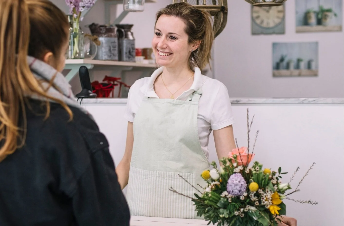
The Problem
Ordering a beautiful bouquet as a gift is a common gesture, but it can be tough for busy individuals to keep track of special occasions and ensure timely flower deliveries. Moreover, many struggle to make purchasing decisions within their budget. They need a better way to:
1. Seamlessly manage their orders and pre-orders
2. Stay informed about product delivery or pickup status
3. Discover products that fulfill their desires while staying within budget.

My Role
This project was done individually. I planned and directed the whole thing, including UX research and UI design.
The Goal
To improve the online ordering experience for both delivery and pickup, I will develop a feature to easily manage and track multiple orders, along with a flexible option that gives users more control over their budgets.
Persona

“I really enjoy making the best use of my time and I'm totally dedicated to my role. I hope to perform as best as I can.”
— Marco, a 43-year-old doctor with a demanding schedule

Goals
- Manage gift-giving easily
- Minimize the time and effort when ordering flowers
- Stay updated on delivery status
Frustrations
“I’m busy at work, I often forget someone’s birthday, but better late than never.”
“I don’t have time to pick out the flowers and a good sense of beauty.”
“I have to check if the delivery arrived.”
Bio
Marco is a doctor at a mid-sized hospital with a busy and unpredictable schedule. He values his relationships with his family, friends, and key clients. Marco once forgot his wedding anniversary, letting his wife down. He often forgets important occasions and has limited time to pick out gifts for them. Marco wants to find a thoughtful and efficient way to handle gift-giving.

“I love decorating my place, and keep learning new things to energize my life.“
— Cathy, A 29-year-old, education professional with budget concerns
Goals
• Apply the budget wisely to every purchase
•. Access product information easily
• Get instructions for take good care of these flowers
Frustrations
“What I'm supposed to buy is sometimes too expensive.”
“I know very little about the flowers I bought or how to take care of them properly.”
Bio
Cathy is an education professional with 6 years of teaching experience who lives on the outskirts of Taipei. In her free time, she enjoys gardening with her neighbors and creating floral arrangements to brighten her living place. She takes the time to learn about flowers and carefully allocates her monthly budget to support this hobby.

User Journey Map
-

Go to flower store
- Excited to discover new things
- Happy to find a nearby store -
Express needs to clerk
- Overwhelmed with decision making
- Confused by unclear information
- Happy with recommendations -

Wait for flower wrapping
- Impatient due to long wait
- Unsure of wait time -

Write card
- Disappointed by delay
- Excited to delight recipient -

Make payment and fill deliver form
- Relieved and pleased
- Dissatisfied with inconvenient process

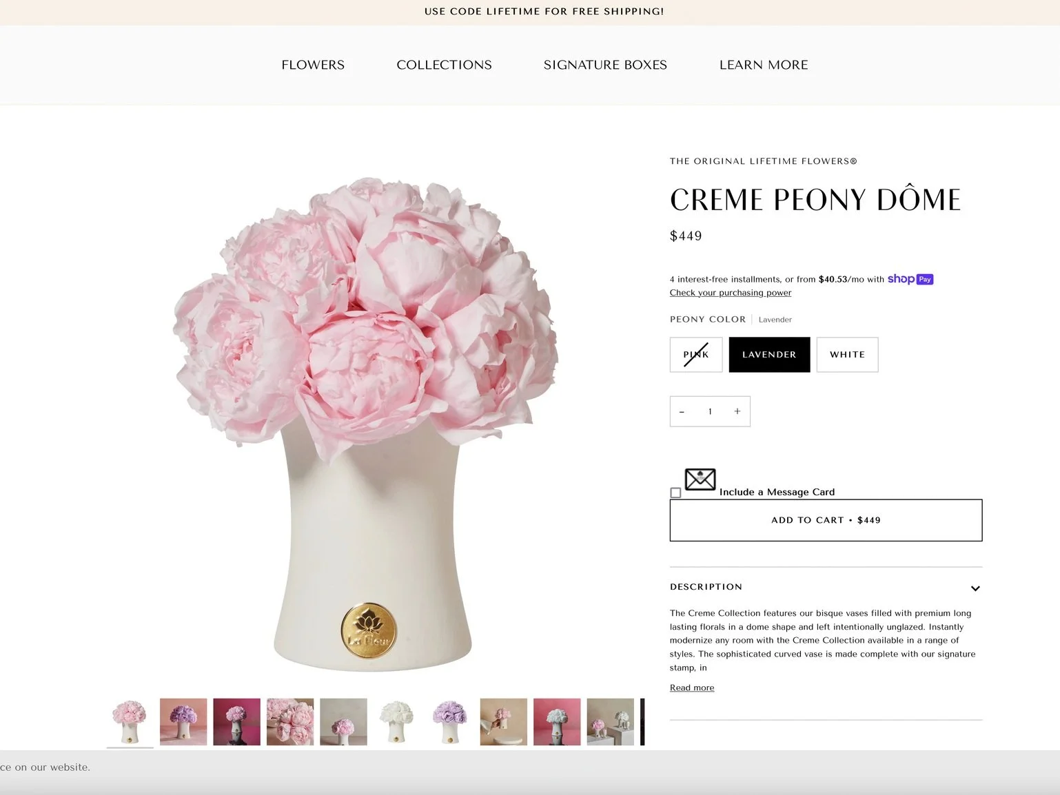
Competitive Analysis
Ribbon
Arena
La Fleur
Schedule
Only regular subscription
Only regularly subscription
No
Product Option
Single option
Single option
I studied the market and found three potential competitors.
While they all offer local flower delivery, they lack preorder options, flexible budgets, and streamlined checkout. They do have some features worth considering for future versions, like product ratings.
Checkout Info
Save payment
Save recipient
No
Rewarding program
Product rating

Color option
Save payment
Good to Have
Attached card
9 language modes
Value Proposition
-
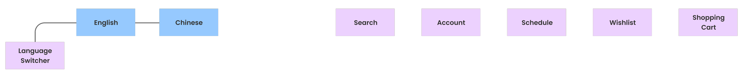
Accessibility
- Choose native or common language mode
-
Easy Order Management
- Track and manage order status at any time
- Set up pre-order notifications -
Time-Saving
- Online payment system
- Save and autofill payment information
- Save and autofill delivery information -
Budget-Flexibility
- Beautiful and affordable purchasing options
- Promo code

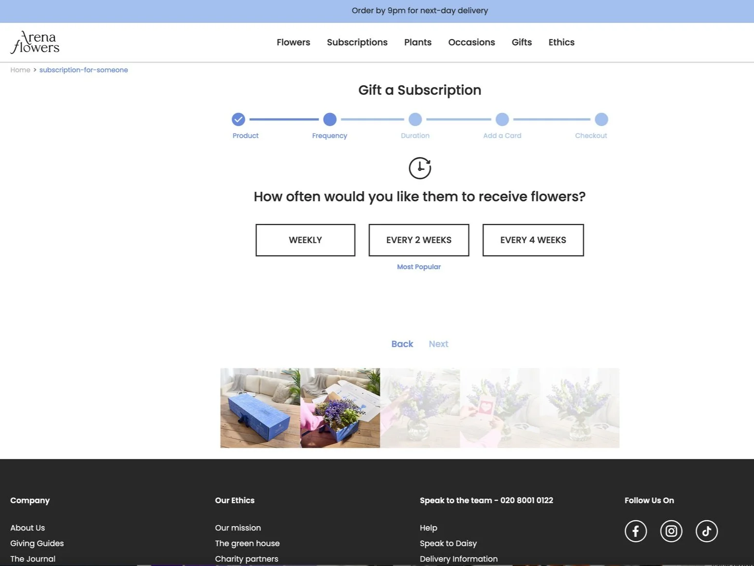
User Flow
Order / Checkout / Add a new event
I take the time to understand the journey users typically take when ordering online and scheduling, ensuring that the process is clear and directly addresses their needs. I always refer to the goal statement and value proposition to make sure their experience is as seamless as possible.

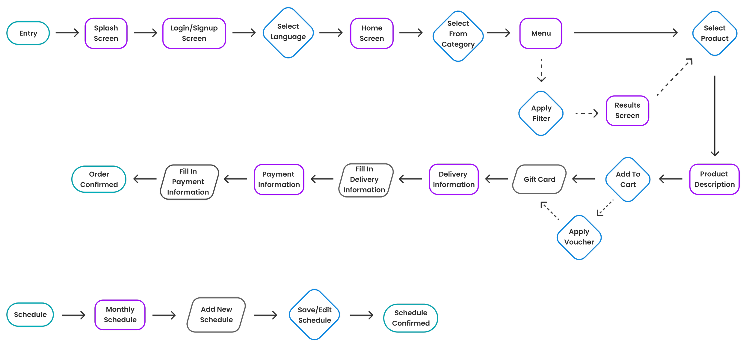
Sitemap
I carefully designed a structure to help my persona achieve its key objectives. By implementing a hierarchical structure overall and a sequential structure in the purchasing process, I aimed to address users' pain points and provide them with easy navigational experiences.
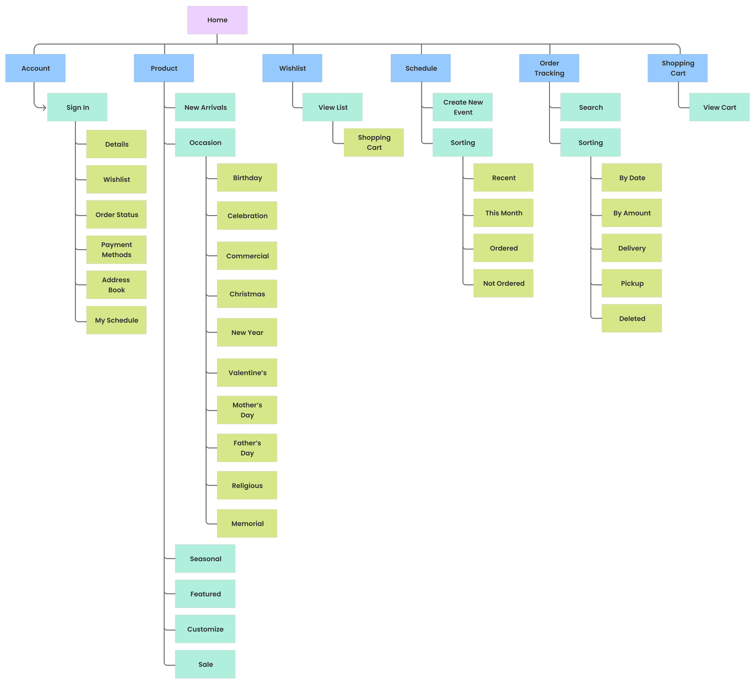
Header
I placed the important tasks in the header, following a common practice in existing shopping apps that users are familiar with.
Footer
Placed the minor tasks in the footer to reduce user distraction and minimize interaction cost.


I began with the desktop version and focused on making the home screen visually appealing. I created distinct layouts for various categories to ensure variety. The primary functions of the product are placing orders and scheduling. The associated features include checkout and order tracking.
Too Simple!
Too complicated!
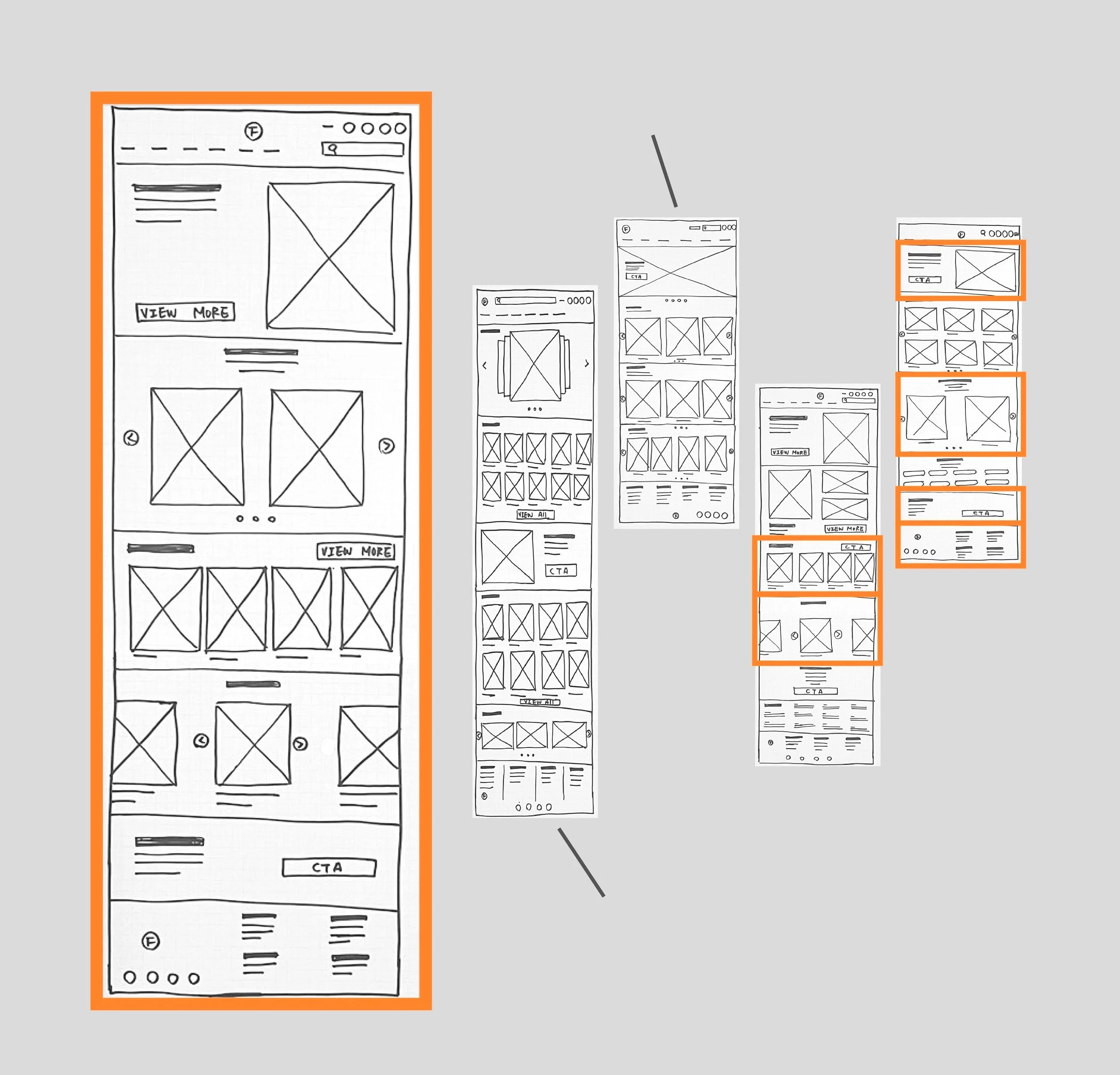
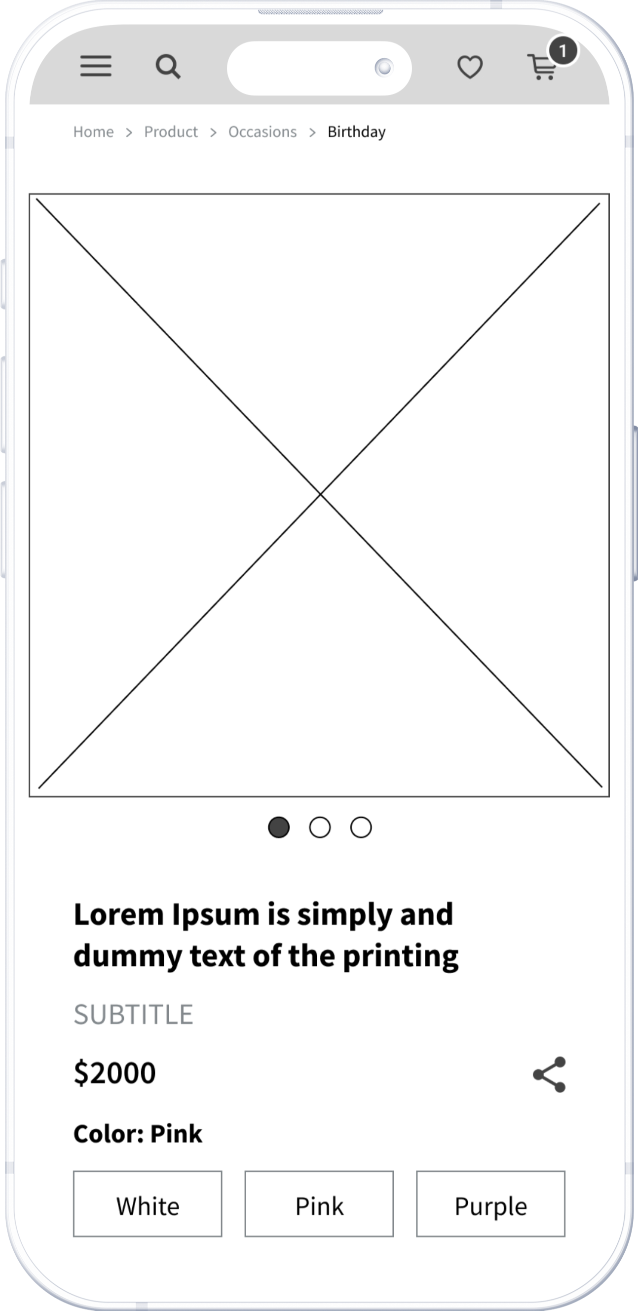
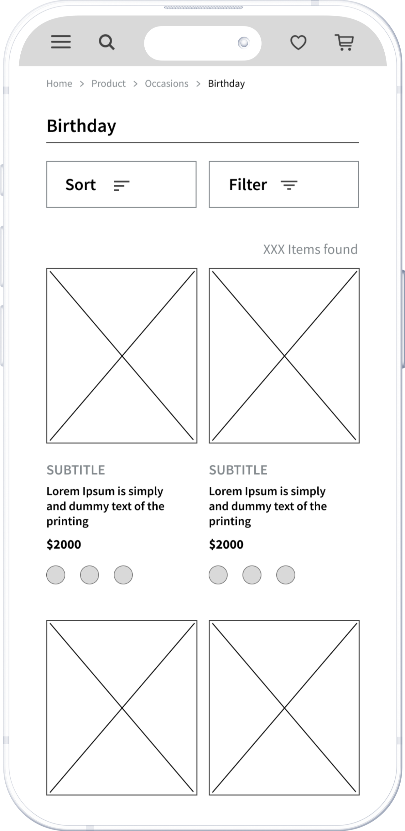
Paper Wireframe

Initial UI design and Wireframe
The main task is shopping. Clear product information and autofill for returning users will help them complete the task. Visually, leaving appropriate negative space for readability.
Here we go!
Home Screen

Lo Fidelity Prototype
The primary user flow I created was for ordering. After the user completed the order, they were directed to the “order status” for a second confirmation.
To Understand the user
Usibility Study
Parameters
Study Type
Moderated usability study
Participants
Number : 5
Age : 21-50 years old working professionals
Location: Taipei
Frequency : Buy flowers at least 4 times in a year
Length
20-30 minutes/Per
I needed to identify the specific difficulties users encounter when trying to complete the core tasks of the web app. For this, I logged time spent, conversion rates, and identified where users were getting stuck. Participants are required to complete two tasks:
- Place an order
- Add a new event to the schedule
The insights gained from this study will guide me in modifying the prototype before moving on to the high-fidelity version.
Insights
-
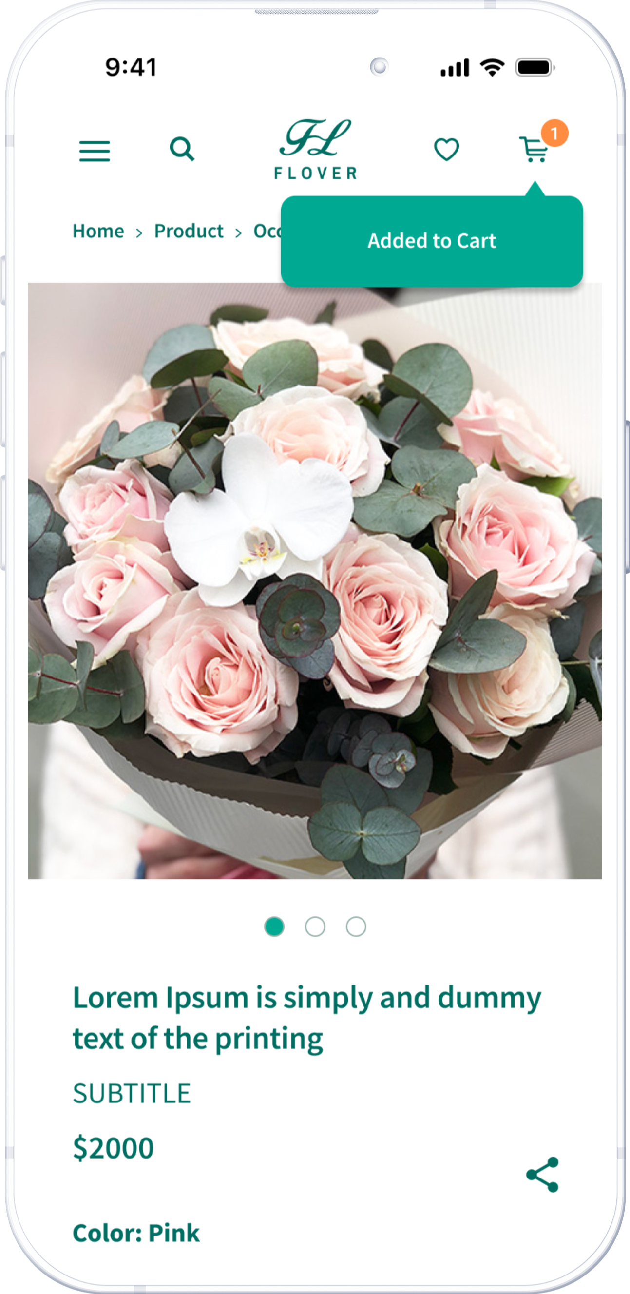
Adding Items to Cart
Many users missed the shopping cart icon at the top and weren't sure if they had successfully added an item. After clicking “add to cart,” providing clear feedback is important.
-
Adding New Events
Users often click on a day in the calendar to add a new event instead of using the "add new event" button. Allowing multiple ways to add a new event is important.
-
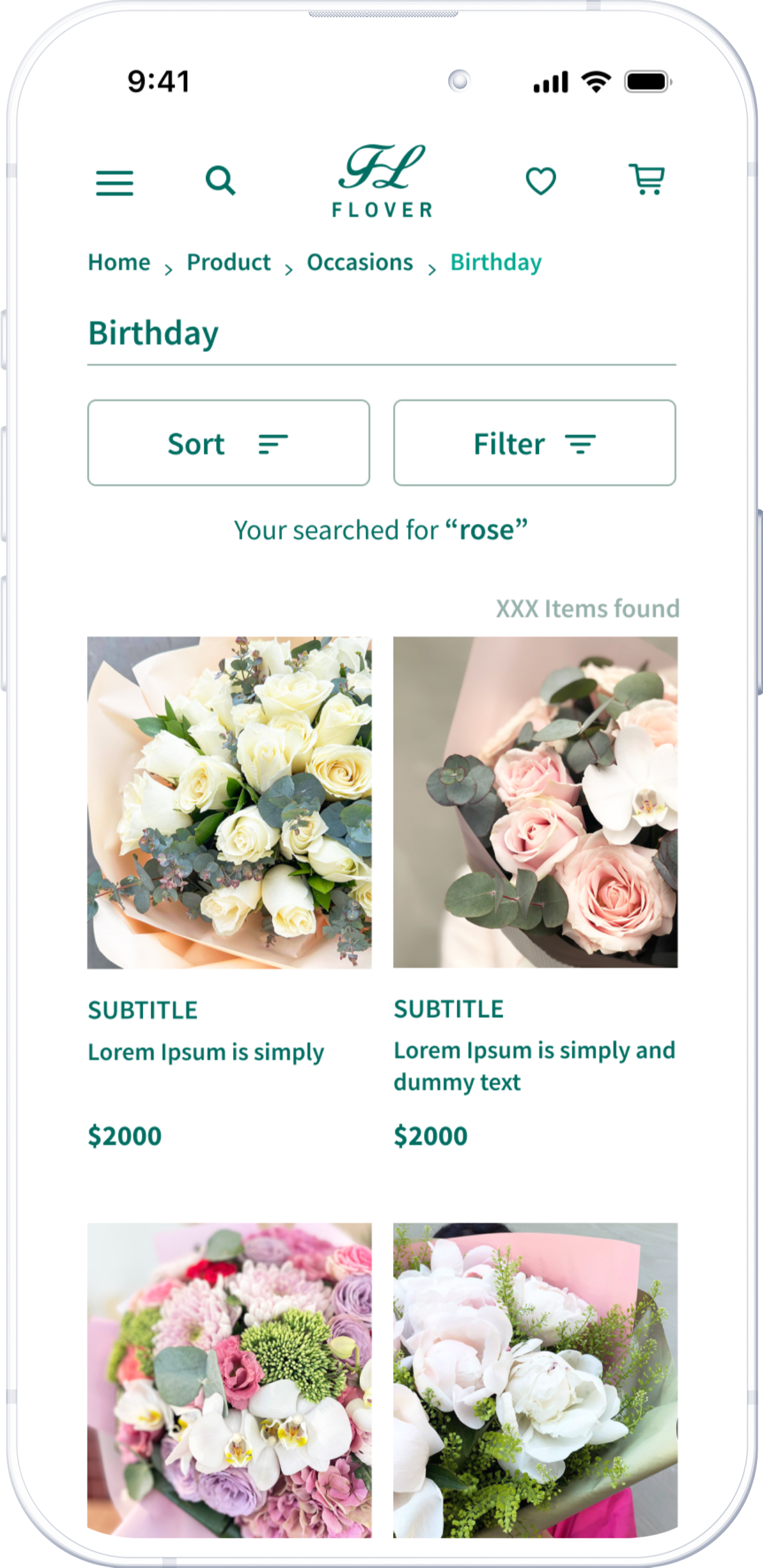
Search Results
The search results page should retain the initial text to make it easy to edit and efficient.

Design Iteration
The product page displays a popup notification immediately after the user adds an item to the shopping cart.
The results page clearly presents the initial request at the top.
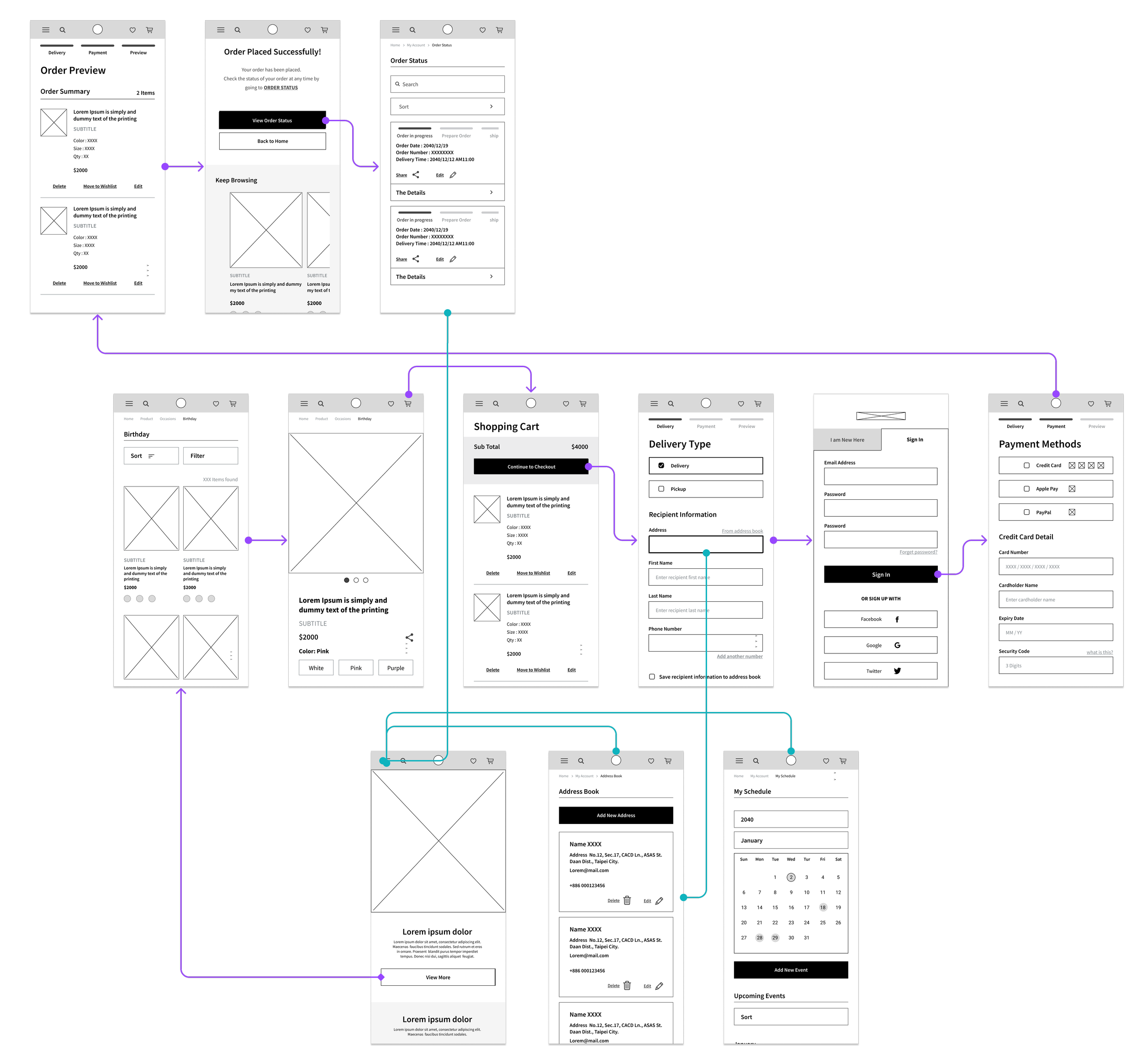
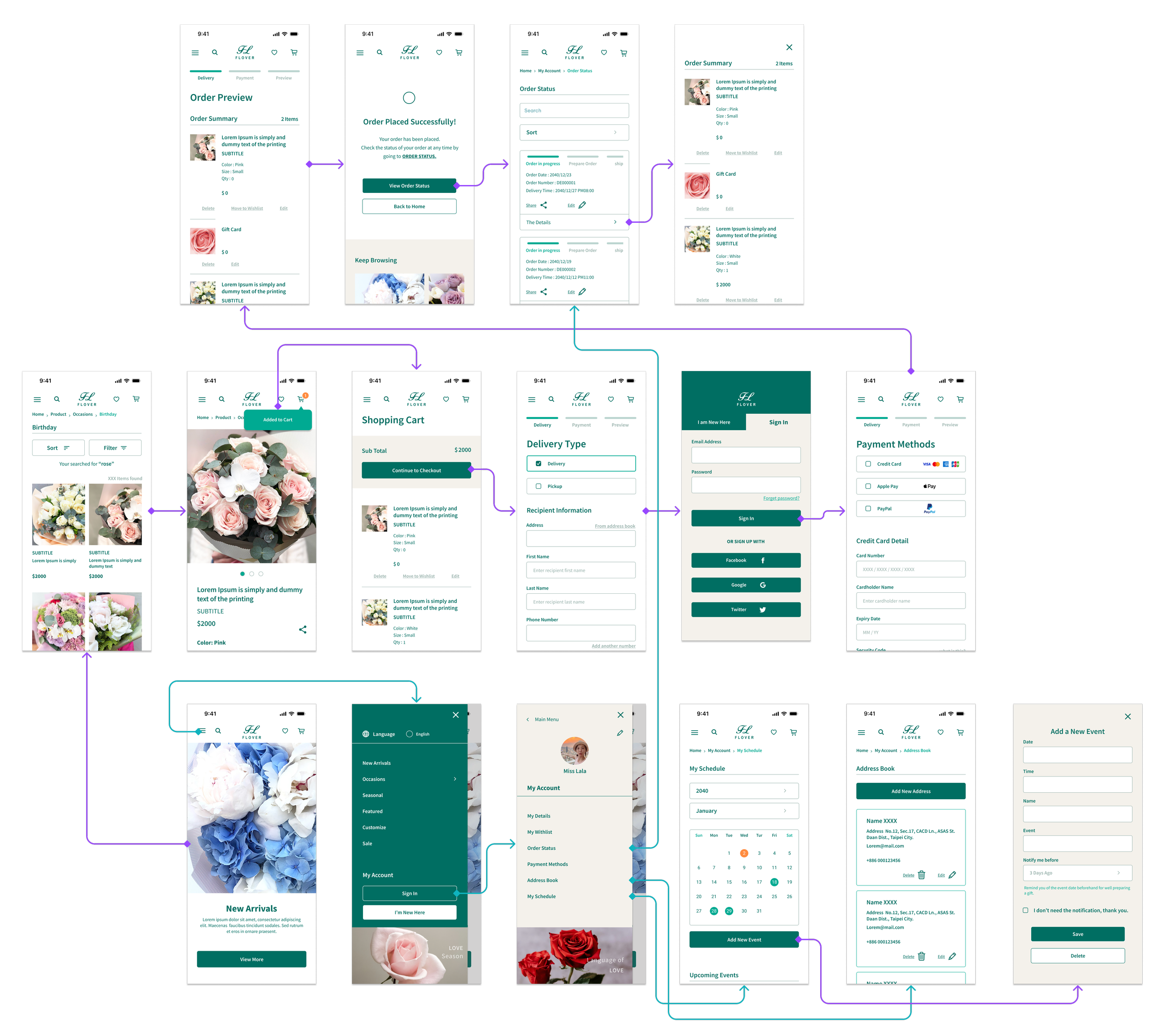
Hi Fedility Screen Flow
The final design showcased the main user flow from browsing to checkout. It also displayed order status and other features exclusively for logged-in users. The primary color scheme comprised green and earth tones, evoking a natural and plant-related aesthetic.
Here we go!
Home Screen


Hi Fidelity Prototype
Preorder management
Users can schedule events and place preorders in advance or place orders upon receiving a notification.
Address Book
Users can save frequent recipient information to the address book for faster checkout.
Review Order Status
After completing an order, users can check its status, edit it, and share it with others.
Filter and Sort
Users can narrow down results by applying multiple filters and sorting options to find suitable items.
Product Navigation
Users can select different sizes and colors, and view floral information on the same page.

Closing Thoughts
Takeaways
E-commerce presents a unique challenge as customers can't physically see or touch the products before buying. Studying existing websites to understand user behavior and habits enables me to reduce the learning curve. I also gained valuable insights through user testing. It's important that design focuses on addressing users' pain points rather than designer preferences.
Since this is a course project, I believe there's still more work to be done. I'm looking forward to validating the design with real-world users.
Next Steps
- Enhance customizable flower selections
Like "build your own bouquet”, or “choose wrapping
paper” feature to improve user engagement.
- Promotions and Offers
Integrating a section for highlighting promotions or
offering loyalty programs could incentivize purchases
and user engagement.
- Different contexts users
Consider users in different contexts, like regular
subscriptions or multiple order.